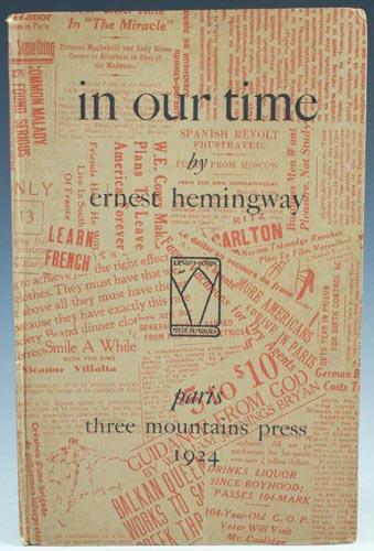
Hemingway's in our time [sic], the European 1st Edition (1924) and its Suggestive Cover Art
New Criticism's "the text, itself" rule often causes scholars to ignore important "paratextual" evidence that authors chose to include. Like T.S. Eliot's footnotes to "The Wasteland," the cover art a novel's readers encounter before they read the first word of "the text" might be said to influence their preconception of the work they will encounter. It might set a mood, or even suggest specific interpretive strategies that would enable the wise reader to get much more out of, say, "A Very Short Story" than the reader who never saw the cover art. In 1924, one year before the American first edition of In Our Time was printed, the tiny "Three Mountains Press" in Paris brought out a limited edition (170 copies) of a text titled "in our time" with a printed cover. What does the cover image suggest to the book's readers about how to interpret the internal text Hemingway wrote? What does it mean that the 1925 American first edition's cover had only an abstract embossed design of concentric squares, and a dust jacket containing adulatory comments about the book by Sherwood Anderson, Ford Maddox Ford, Waldo Frank, and other (then) well-known novelists? What does it mean that the 1925 English first edition was published with a plain green buckram cover and a dust jacket containing only the title and author's name set within a square of printer's ornaments?
A similar challenge to the NC "the text, itself" rule of
literary self-sufficiency also can be found in
the "Cugat" dust
jacket created for the first edition of The Great Gatsby.
The link will take you to the online article about the process by which
Fitzgerald's text influenced the cover artist, Francis Cugat, and the
way in which Cugat's cover art may have influenced Fitzgerald's final
revisions of the novel. Matthew Bruccoli's examination of
Fitzgerald's correspondence revealed that "the artist’s
image preceded the finished manuscript and Fitzgerald actually maintained
that he had “written it into”
his book." As far as I can determine, no similar research has been done
regarding any connection between Hemingway and the appearance of the In Our
Time cover art, but the circumstantial evidence raises the possibility that
he designed it or ordered its design. Click here for a comparison of rare book dealers' asking prices for copies of first-edition Gatsbys with and without the Cugat cover, which is very, very rare.